TLDR
I built a visualizer to help my family’s move to Palo Alto (with a 2-year old) by mapping police incidents from official reports. Sifting through daily police report log PDFs was painful, so I created a pipeline that scrapes the logs, extracts locations, and plots events on Google Maps. This weekend project actually helped us seal the deal on our spot! Code’s on GitHub.
A 1-minute demo is shown below. Read on for the story.
Why Palo Alto?
Transitioning from being a Founding ML Engineer at SkyLink (YC W22) to a startup founder meant picking our next home base. Palo Alto won for its startup ecosystem, Stanford proximity, and preschool options for our toddler.
Family joke: we apparently hate financial peace, moving to one of America’s priciest areas right after giving up a steady paycheck.
House Hunting
During our house hunt, we’ve often found places that are too good to be true. This made us wonder if the place is in a good neighborhood. We later learned that the rental market moves quickly; cheap doesn’t always mean flawed, and expensive doesn’t guarantee quality.
When we asked one of the apartment managers about how the area is in terms of safety, they mentioned that we could look at the Police Report Logs to get a sense of it.
The Report Logs
They generally publish the last 30 business days of report logs as individual PDF files (one per day). Here is a snippet of a log from April 18, 2025:
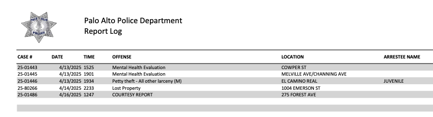
Looking at each PDF file was tedious to get a sense of how frequent different types of events are reported in an area. Especially, when scouting multiple places online, and we needed to act fast as places were getting rented quickly after being posted online.
The Idea
My wife mentioned automating the process of downloading all the files to go through them quickly. Inspired by the classic GIF of Bryan Cranston replacing the bulb in “Malcolm in the Middle”, I wanted to take it further by extracting the text from the PDF.

Source Code & Architecture of Vibes
One thing led to another, and I ended up building a pipeline to showcase the different events visually on Google Maps. Since the end goal wasn’t clear initially, I just “vibe-coded individual steps with regular spot checks and pieced them together at the end into a full pipeline.
- Monorepo contains the code of the full pipeline, including intermediate results, and some archived scripts that were tried and discarded.
- Visualizer (hosted on Vercel) is included as a submodule with its own dedicated repository.
The READMEs of the repositories contain more details if you want to dive deeper. The code is messy and has a lot of LLM slop but it works AFAIK. Open to PRs!
Here is a high level overview of the pipeline:
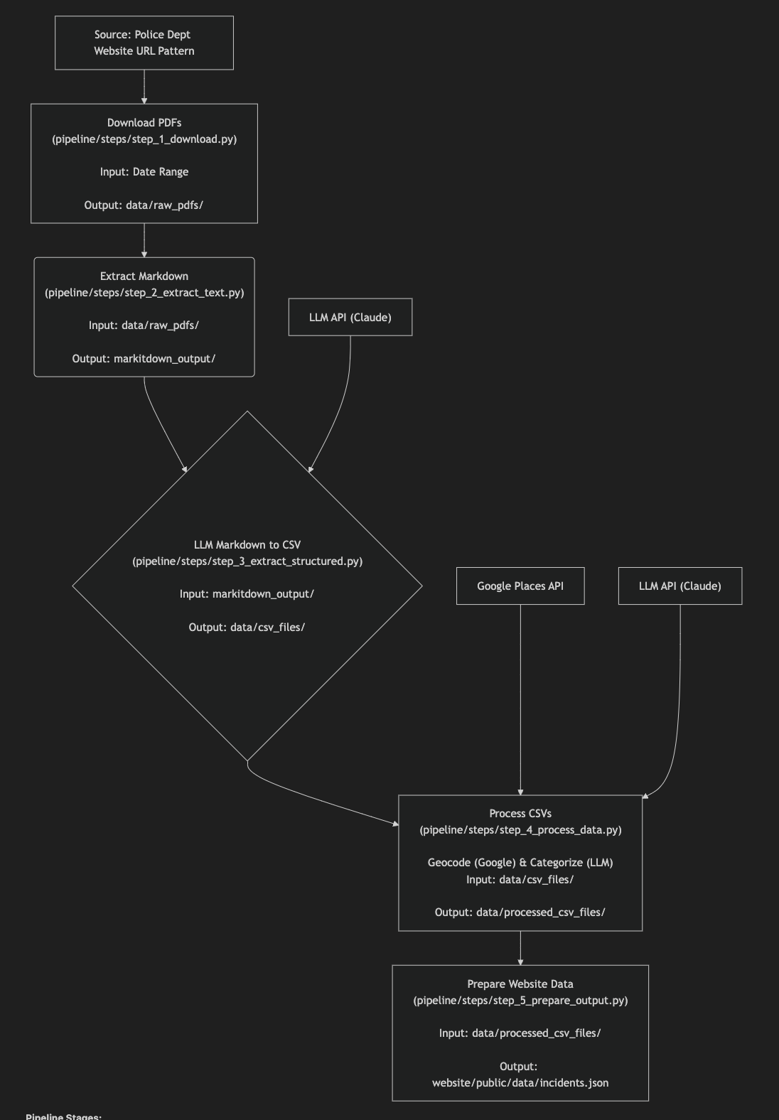
Main technologies used:
- LLM processing:
claude-3-7-sonnetvia AWS Bedrock - PDF to text: github.com/microsoft/markitdown
- Geocoding: Google Maps Platform - Places API - Text Search (New)
- Visualization: react-google-maps
Learnings
- LLM Tools: This was my first “big” project using Claude Code beyond landing pages. Like Cursor, it excels at well-defined small tasks but struggles with high-level project instructions despite careful prompt engineering.
- Task Decomposition: With the right task breakdown,
gemini-2.5-prois a superpower for rapid iteration in Cursor/Windsurf. - PDF Challenges: Vanilla text extraction from PDFs remains surprisingly difficult in 2025. LLMs offer incredible horsepower in cleaning up the parsing, though.
- Vercel FTW: Vercel makes deploying pet projects delightfully simple.
- Time Investment: The actual coding took just 3-4 hours, but repository cleanup and blog preparation took a full day. It’s a constant learning that perfect is the enemy of done.
Disclaimers

-
Data Verification: I did NOT rigorously verify the pipeline’s accuracy. A handful of PDF files may have been dropped due to parsing errors. I performed spot checks to be confident enough for my own use and had my wife verify ~10 events to confirm I wasn’t hallucinating.
-
LLM Limitations: I use LLMs professionally and know firsthand their fallibility (often painfully so). I only used them for well-defined smaller tasks where they are more likely to excel and quick vibe checks are possible. Links to the original PDFs were included for each event so that users can verify information. The visualization and filtering are the main value-add here.
-
Development Approach: Vibe-coding allowed rapid iteration. The cleanup process for public sharing was intentionally uncomfortable. Part of my commitment to ship faster, even if imperfect.
-
Sensitive Topic: Crime and policing data require thoughtful handling. I don’t intend to sensationalize statistics toward either polarity. The goal was simply to aid informed decisions using available public information.
Fin
A couple of days after creating this tool, we confidently finalized a place in Midtown. While the visualizer was ultimately just one tool in our house-hunting arsenal, it gave us a sense of peace when making this significant long-term decision.
Thanks for reading! Here is my Twitter for more chatter.